Hello, my name is Ben McCanny.
I'm passionate about the design and development of great user experiences.
This portfolio showcases the design-oriented projects I have worked on, which include elements of post-WIMP interaction, web design, front end dev, UX design, mobile development and HCI research.
The Projects
-
Back to menu
Gone with the WIMP
-
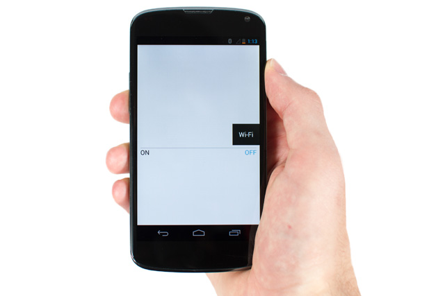
1

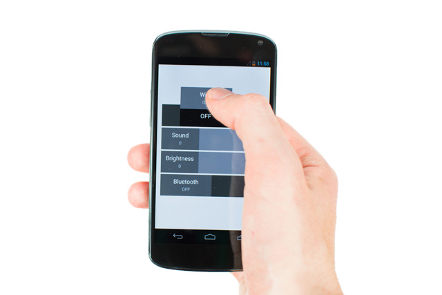
A Slide-Out Drawer widget designed for a two-tiered settings hierarchy. Shown set to ‘off’.
-
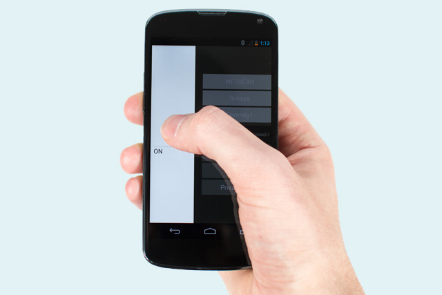
2

The user begins to drag the control by its label towards the ‘on’ state.
-
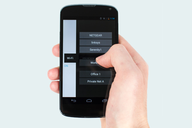
3

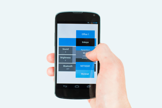
The user selects a Wi-Fi network name.
-
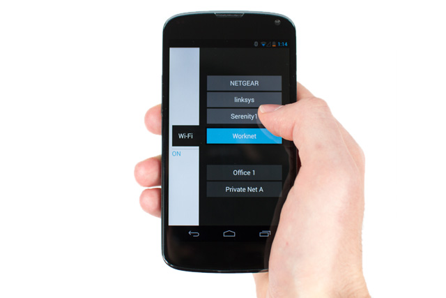
4

The user releases the network name into the connection dock.
-
5

Among a series of track-based controls, the user picks up the Wi-Fi control, dragging it right towards the 'on' state.
-
6

Once past the 'on' threshold, the user selects a network by dragging up or down and releasing the control over the desired network.
Background
Working with Prof. Daniel Wigdor 🔗 of U of T’s Dynamic Graphics Project 🔗, I spent a summer internship exploring direct physical manipulation interfaces.
Goals
- Create a series of novel direct manipulation interfaces.
- Design these interfaces to eliminate the need for desktop-style form controls.
Constraints
- Must emphasize touch sliding over tapping interaction.
- Must be adaptable to a variety of display sizes.
Motivation
Direct-touch user interfaces often rely on a metaphor of direct physical manipulation for gestural input. However, some UI components in modern touch-based UI’s fall back on WIMP (Windows, Icons, Menus, Pointers) paradigms of pointing and clicking. These tend to be tasks requiring input, such as adjusting settings, and editing text. This has led in part to a general disillusionment in the use of ‘consumption’ devices for ‘creation’ tasks.
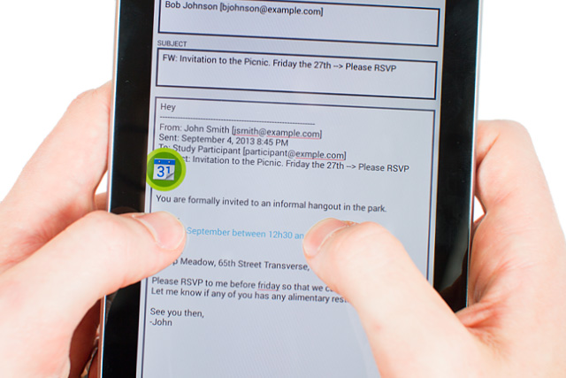
To address this, I created several designs meant to complete the use of the direct manipulation metaphor for mobile devices. These included interfaces for settings modification (1, 5) and accessing inter-application functionality (8). I then conducted a user study comparing these designs with visually similar interfaces that used WIMP controls (7). The study demonstrated a strong user preference for the direct manipulation designs as more enjoyable to use.
-
7

WIMP versions of the interfaces were created for comparison in the study, replacing the sliding interactions with a series of tapping-based buttons.
-
8

In this draggable text interface, the user selects a date with two fingers and a calendar Rapid Ring appears.
-
9

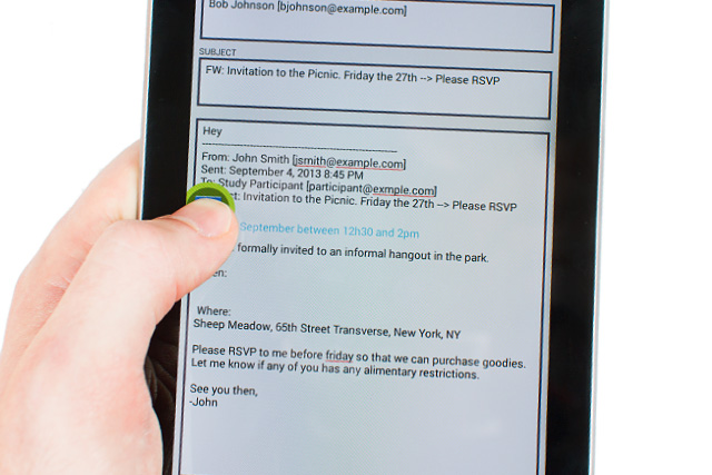
The user drags the selected text to the ring and drops it.
-
10

The calendar application launches with a new item prefilled for that time.
-
-
Back to menu
Undergraduate Thesis
-
1

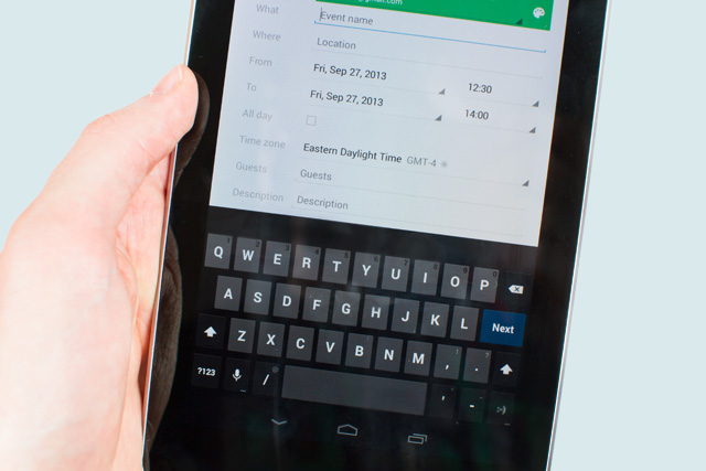
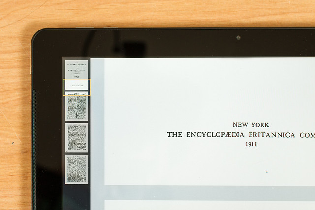
Document annotation prototype Annotra.
-
2

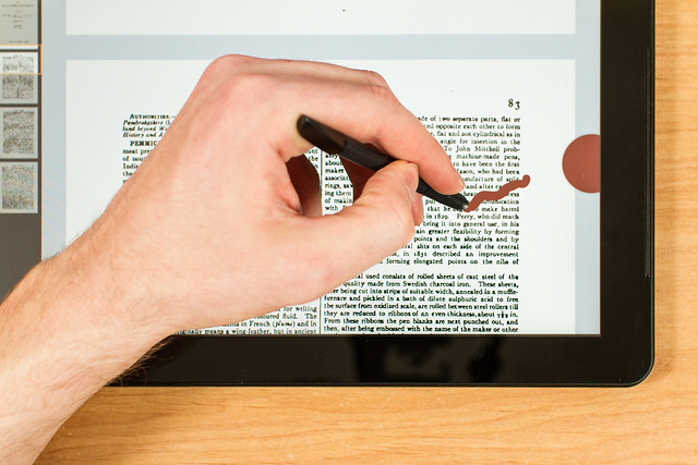
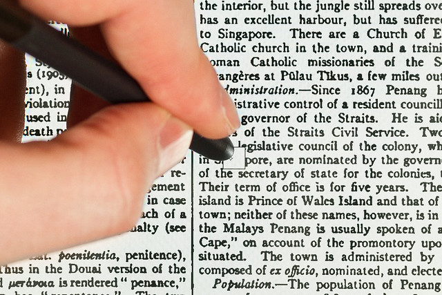
The user can immediately ink with an active digitizer stylus.
-
3

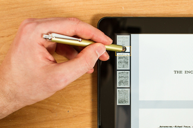
Less capable passive stylus devices are also supported.
-
4

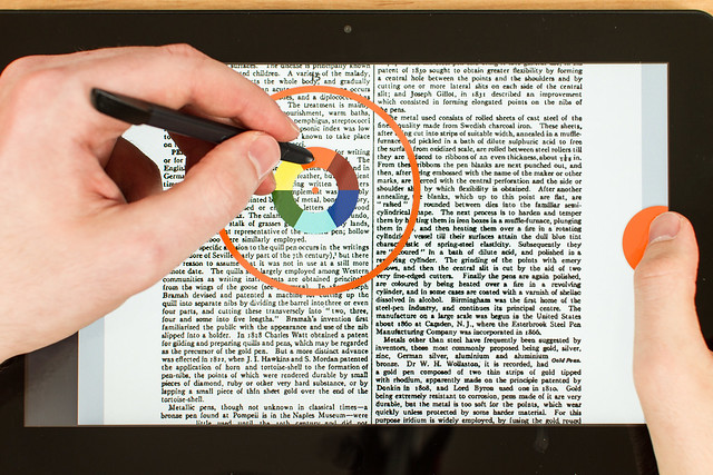
The user selects a brush color through a bimanual gesture, where the non-dominant hand is used to engage a brush selection palette. Crossing into a color swatch with the stylus causes the brush color to change.
-
5

Crossing into the palette's outer ring allows the user to select a brush size by resizing the ring with the stylus – this can also be done mid-stroke.
-
6

The user taps a button that appears at the end of a hover-based gesture.
Background
Working with Prof. Wigdor 🔗, I completed an undergraduate thesis on the topic of pen and touch interfaces. We examined improving the content creation experience on tablet computers using stylus devices. The product of this work is a proof of concept application called Annotra.
Goals
- Create a novel, enjoyable experience for a content creation task on a tablet using a digital pen with multiple degrees of freedom input.
- Take advantage of the extra degrees of freedom afforded through stylus tip pressure detection, on-stylus buttons and simultaneous pen and touch interactions.
- Adapt this experience to platforms with limited capabilities, such as a standard touchscreen device paired with a capacitive stylus.
Constraints
- Avoid the use of WIMP (Windows, Icons, Menus, Pointers)-style components where pens fair poorly.
- Limit the amount of travelling of the pen across the display.
- Minimize the amount of explicit mode switching.
- Emphasize the pen’s natural aptitude for smooth, flowing stroke gestures.
- Provide fallback designs for less capable devices (see 3).
Process
We undertook the project with the hypothesis that a lack of commercial success of digital pens did not mean the devices were insufficient for content creation tasks. Rather, we felt that a dearth of interfaces tailored to pen strengths was to blame for tepid user adoption.
We attributed the lack of commercial pen interfaces to what we termed "the breadth–depth dichotomy": Application developers with limited resources are forced to decide between designing a deep, highly tailored experience for multitalented devices, or target a broader array of platforms, where they must make compromises in the interface to support the lowest common denominator. Critically, this often means resorting to a WIMP interaction style, a paradigm where pens fair poorly.
For Annotra, we selected document annotation as the creation task. Following this, a series of brainstorming sessions were conducted, both individually and with a group of people from the lab. An initial feature set was derived from the ideas generated by these sessions. The ideas were selected based, in part, on their ability to coexist and form a cohesive interface that accomplished the functionality necessary for document annotation.
These features included selecting a brush color (4) and size (5) drawing and erasing ink (2), efficiently navigating the document (3, 8) as well as cut, copy and paste (7). Not only did we want to support these functions using non-WIMP interfaces, but also the interfaces, or some facsimile, had to accomplish the functionality with only the input capabilities of the standard touchscreen tablet (where a capacitive stylus acts only as a proxy for touch).
-
7

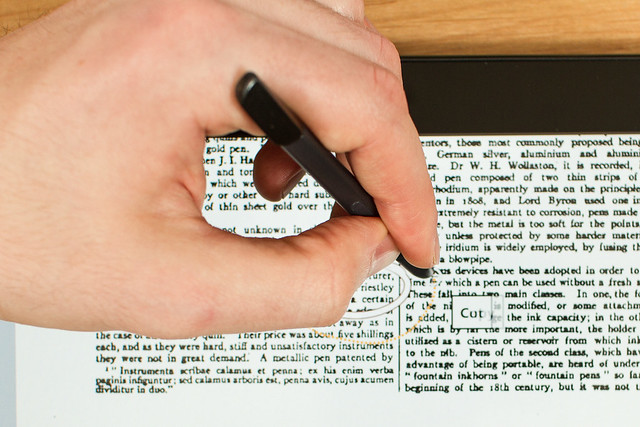
In a single enclosing gesture the user cuts an annotation, simultaneously selecting the action to be taken by varying the pressure applied throughout the gesture.
-
8

Using a passive stylus, the user flicks between inkings with a bimanual gesture.
-
9

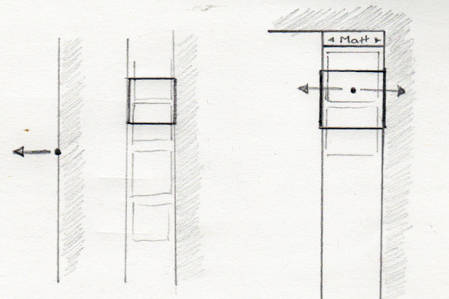
Early brainstorming sketches of the overview scrollbar, showing it pulled out from the edge with pen or touch. Horizontal flick gestures transition between annotations of different users.
-
10

Pulling the scrollbar further to the left reveals a tray with other recently opened documents. The available documents can be browsed by panning left to right, while the contents of an individual document can be seen by panning up and down. Dragging a file name handle from the top of the screen to the left of the current document scrollbar opens the corresponding document in annotation view and closes the tray.
-
-
Back to menu
500px mockup Visit Site 🔗
-
1

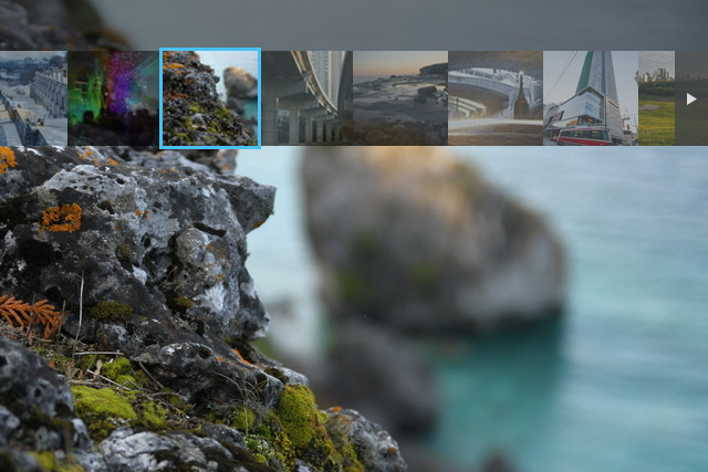
My exploration of how a photo sharing website could update their main photo page emphasizes the photo and minimizes distracting aspects of the interface. Here, a photo navigation bar appears over top of the main photo on mouseover, keeping unnecessary elements from view until they are needed.
-
2

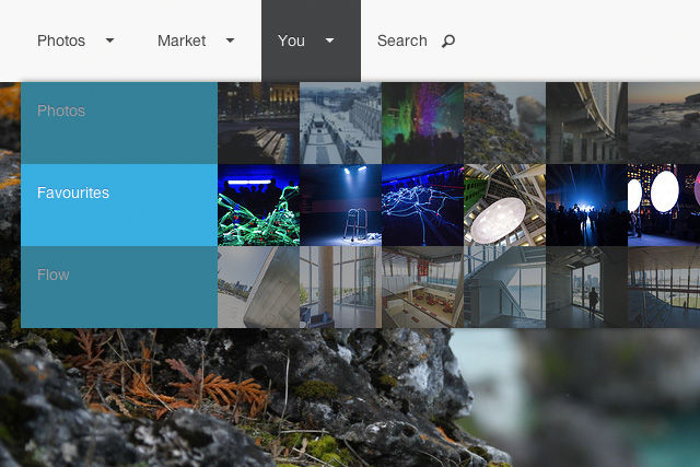
The menus linking to other sections highlight thumbnail previews of each section's photos on mouseover, giving the user greater context before they navigate to a section.
Background
For a recent application to a position at a photo-sharing website, 500px, I produced a mockup of how I thought a 2013-era photo page should look and behave. This came before their own 2013 site update, which adopted a flat-UI appearance.
Goals
- Put more focus on the main photo.
- Rearrange components to make the page easier to understand.
- Adopt a flat-UI aesthetic.
- Make site navigation richer and more visual.
Constraints
- Maintain elements of the existing site's aesthetic.
- Retain most or all of the existing features.
- Craft a new experience without challenging the company's basic assumptions about their product.
Process
To place emphasis on the photograph, I decided to use a single solid color background, unlike the existing site, with its division of the page into a dark navigation header and a light gray background. I wanted to maintain some of the strong contrast of the current site; many elements appear with a dark gray background, such as the main navigation items on rollover (see 4). The dark gray contains a hint of blue to further contrast with the background and to tie it in with the blue of the logo. Hints of the logo’s blue are spread throughout the mockup and the use of green has been eliminated to reinforce the brand.
Many components were reorganized, most notably the current set navigation found on the right panel in the current page. I felt that this was a rather convoluted organization, having the photo’s metadata appear both above and below an element whose purpose was to take you away from the current photo (5). I experimented with putting it on top of the main photo or on the right, aligned with the top edge of the photo. I found both of these options placed too much emphasis on navigation and distracted from the main photo. I opted to hide the navigation, having it roll out from underneath the edges of the main photo on hover (1), similar to the way YouTube video labels and playback controls appear and disappear in their embedded and full screen players.
Despite abandoning the set navigation at the top of the page, I liked the concept of revealing other sets arrayed vertically below the current one as an intuitive and fast way of jumping to one of many other photos. I used the same principles to augment the existing navigation dropdown menus with a set of browsable thumbnail previews for each section (2). This stemmed from a strong belief that a photo website should have a uniquely visual navigation experience that emphasized its photographic content. Many of the company's icons were retained to maintain a similar visual feel.
-
3

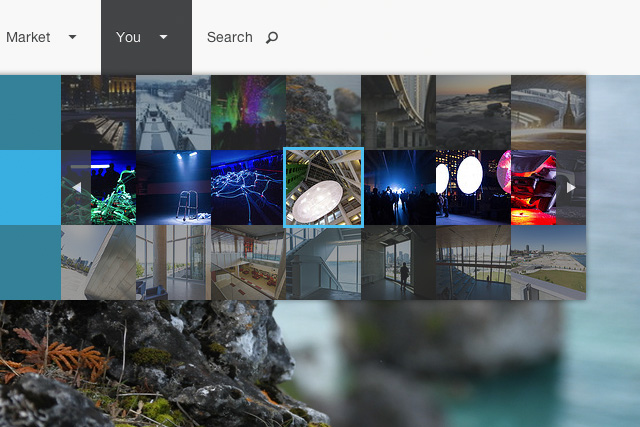
Hovering over a thumbnail highlights it. Clicking it would take the user to that photo within the selected section.
-
4

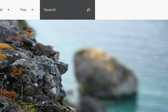
The search bar is presented in a visually similar way to the main menu titles, emphasizing its similar role in site-wide navigation. On hover, the magnifying glass extends to the right, indicating to the user that searches can be performed there by clicking within the gray box. Autocomplete search results would appear below, complete with thumbnail previews for those keywords.
-
5

Before brainstorming ideas for improvements to the site, I broke down the existing photo page by function. I found the current arrangement to be poorly organized, with navigation elements inserted between photo details.
-
6

While brainstorming, I hit on the idea of trying to combine current section navigation with navigating to other sections of the site. Though this idea did not survive to the final mockup due to practicalities of thumbnail size, the idea of integrating thumbnails into the menus can be seen in the finished product.
-
-
Back to menu
DealBlast
-
1

I designed the logo for our capstone project, a targeted deal platform, to embody an upbeat, approachable product.
-
2

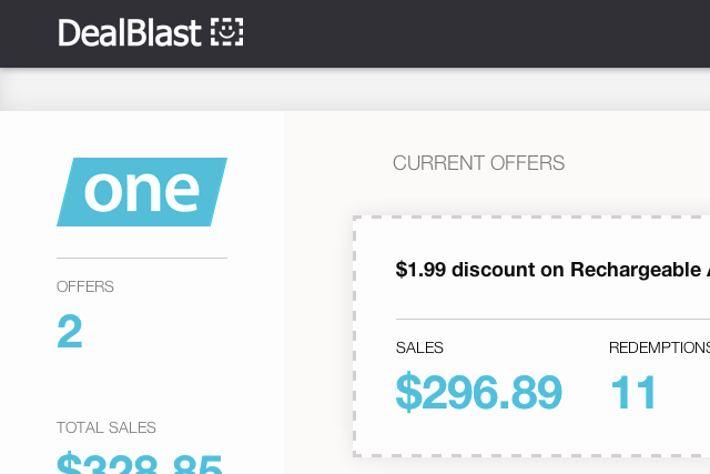
I decided to adopt a system-wide metaphor of the dotted lines associated with paper cut out coupons, which can be seen here in a close-up of the retailer dashboard interface.
Background
DealBlast is the product of my undergraduate program’s capstone design project. A team project, I was responsible for the visual design and code of a retailer dashboard, in addition to the design and implementation of a Ruby on Rails web service that acts as the platform's datastore.
Goals
- Design a friendly, clean interface that was customizable to the retailer's brand.
- Create a single page application capable of creating, editing, viewing and deleting targeted offers.
Constraints
- Had to surface relevant data relating to targeted offers, including offer period, discount and quantity.
- Had to allow for selection of specific products and locations as the target of the offer.
Design
The UI draws from the dotted-line metaphor of coupons, as well as current trends in dashboard design. The prototype uses jQuery UI for the autocomplete boxes and g.raphael.js for the sales bar charts.
It uses Backbone.js to sync with the Rails API and add a layer of interactivity. CSS3 features, such as transitions, are heavily used to create a beautifully interactive experience.
-
3

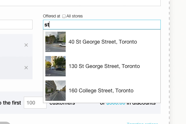
Autocomplete results for the retailer's locations show Google Street View previews of the addresses to aid in selection.
-
4

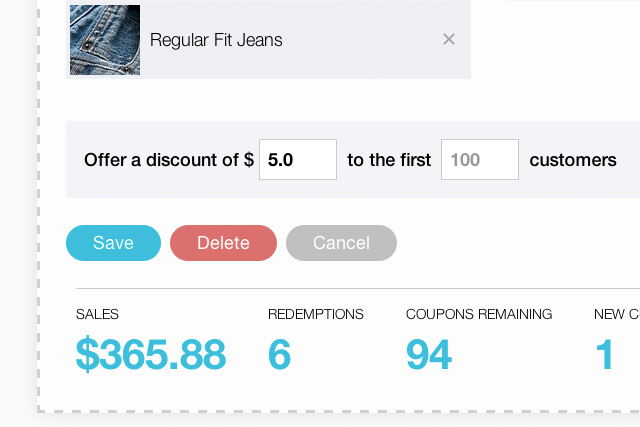
Accent colors throughout the interface are used to incorporate the retailer's brand.
-
-
Back to menu
Skule Announcements Visit Site 🔗
-
1

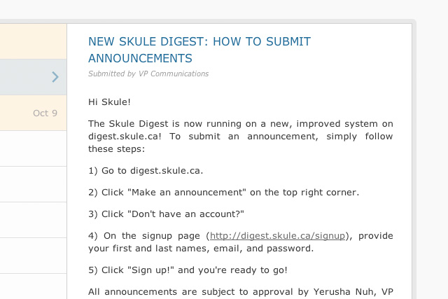
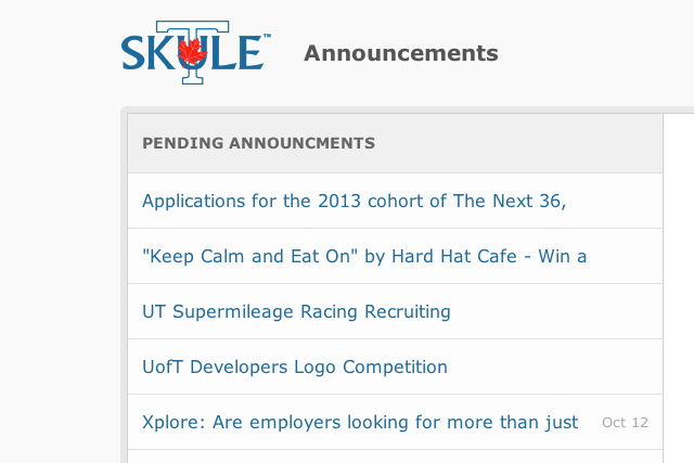
Skule Announcements uses a split screen view, with selectable announcement titles on the left and a reading pane to the right, similar to desktop email clients.
-
2

The design integrates familiar elements of Skule life - the Skule logo and the faculty colors of blue and gold - within a clean layout.
Background
Skule™ Announcements is a Ruby on Rails web application I developed to replace an existing system used by the U of T Engineering Society to send a weekly digest email to all engineering undergrads. The Drupal site used previously was broken and never ideally suited to the task.
Goals
- Design a clean, easy to use web UI.
- Simplify the UI design and back end code over existing systems by tailoring the application to the society’s needs.
Constraints
- Support the viewing, creation and editing of announcements.
- Had to project an authoritative and trustworthy image.
-
3

The interface included buttons with a simple CSS gradient replaced by a solid color background on hover.
-
4

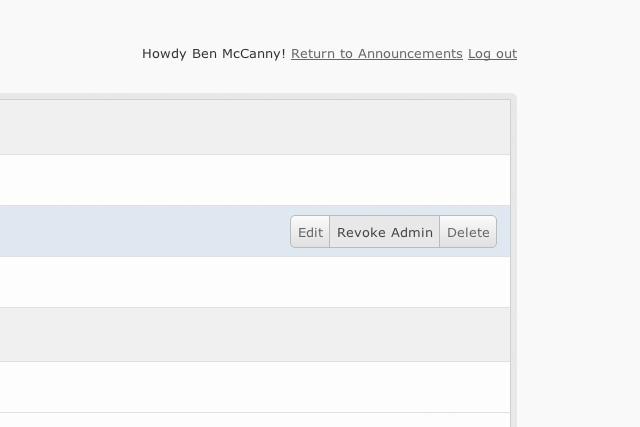
Administrative users see the same interface as unauthenticated visitors, with admin functionality inserted inline in the posts, such as these Approve, Edit and Delete buttons.
Design
I wanted to keep the interface simple and let the announcements define the experience. With this kind of utility-style application, I looked to the 2010-era design of Twitter and various email clients for examples of potential layouts. The layout I chose closely mirrors these applications, condensing announcement titles into one half of the view, while a reading pane fills the other half. The color palette is neutral and sticks to either gray shades or colors associated with the University (blue) or the Engineering Society (blue and gold).
-
-
Back to menu
Frosh Week 1T1 Visit Site 🔗
-
1

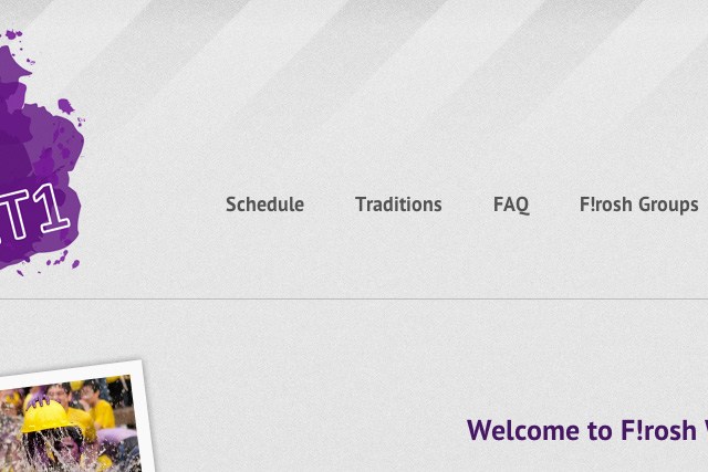
The Frosh Week schedule, with rollover state of the Campus Tours + BBQ + Dye Station
-
2

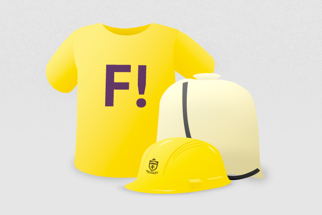
Illustrations were an important part of setting an upbeat, welcoming tone to the site while giving incoming students a hint of the traditions and history of the Engineering Society.
-
3

-
4

The design of the other page content, including selection of fonts, colors and background details followed a similar desire to balance tradition with a friendly first impression.
Background
Frosh Week is U of T Engineering’s orientation week for new students (Frosh). I volunteered to design and code the 2011 (1T1) edition of the promotional website.
Goals
- Craft an aesthetic that would be welcoming to the incoming students while remaining faithful to the traditions and history of the engineering society.
- Build on the distinctive appearance of past sites – dark tones and tight diagonal stripes – with a lighter, more welcoming theme.
- Emphasize the visual nature of the medium with a consistent set of images illustrating the traditions of Frosh Week.
Constraints
- Had to provide students with information about the week’s events, drive sales of Frosh kits and prepare Frosh for the zaniness of the week.
- Had to remain true to the spirit and culture of the engineering student body.
- Had to incorporate the colors of engineering’s Frosh Week – the bright purple of the body dye and the yellow of the Frosh hardhats – without appearing too garish.
Process
I used the “site in progress” page as a testing ground for my initial ideas: light gray, and a bright, friendly font with copious amounts of bright yellow and purple. The background featured a large purple paint splatter with a yellow banner positioned over it containing the page’s message. A band of wide, darker yellow diagonal stripes faded into the banner's background.
I was happy with the results. For the full site, however, I opted for a more conservative color palette. I liked how the fading diagonal stripes had worked on the temporary page, so I adapted those to a gray background, adding a speckled effect to give a sense of the event’s history (see 4). I selected a free web font, PT Sans, for the headings and Georgia for the body text. Together, the typefaces help define the positive, friendly message of the site (1).
Purple was a natural accent color used in the headings, with lighter colors appearing in the schedule.
I used large illustrations on several of the pages to reinforce the friendly tone, while getting around the lack of available photographic visuals to help carry the site (3).
A positive reaction from my peers in the engineering faculty verified the final design's success.
-
-
Back to menu
PinchPlan
-
1

Original Photoshop mockup of what would become PinchPlan.
-
2

First paper sketch of the concept, including several unimplemented features.
-
3

The prototype, showing the single-axis stretch gesture to focus in on a smaller period of time.
-
4

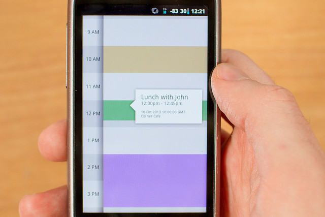
Tapping an event reveals an information card with details of the event.
Background
I began work on a pinch-to-zoom calendar in early 2011, before Android 4.0 introduced an updated Calendar application with a similar feature. At the time, the stock calendar was lacking in personality and ease of use.
Goals
- Implement a calendar application with a one-dimensional version of the pinch-to-zoom gesture for the purpose of zooming in and out of a continuous linear calendar.
- Support a combination of swiping through the calendar timeline and flicking a listing of the events to navigate through a busy schedule.
Constraints
- Had to address basic functional requirements and realities of a calendar application to be a viable alternative to more traditional designs.
- As a self-directed project, there was a lack of external requirements placed on the project.
Design
To visualize the timescale units with minimal clutter, I employed alternating light and dark gray bands. A hierarchy of gray shades was designed to accommodate the different zoom levels – with larger units like months and days having more contrast between their light and dark bands than those of the smaller hour and 5-minutes intervals. The shades of gray representing fine units fade into the coarser, higher contrast blocks as the user zooms out and vice-versa. A double tap also performs a zoom action meant to mimic a similar gesture in the Android browser.
I tried implementing the event list, with its accompanying flick gesture, but encountered issues with the design. The differences in time between two events in the list made the list jump around in jerky ways as the user slid through the adjacent timeline. Although animation easing could likely have improved this, I felt the screen real estate the list occupied and the clutter it added made it not worth the effort. I opted for a design where the user must tap on the colored bar representation of each event to see a box with event details (see 4).
Reflections on Development Work
The project taught me the value of good code organization in large applications that lack the benefit of a prescribed MVC framework. Finding myself with an unfamiliar language and little knowledge of how to structure it, I eagerly rushed to implement UI ideas until the codebase became too hard to navigate. I took a break from the project for several months, with the intention of returning to start fresh, but the release of Android's calendar with pinch zoom made the project seem redundant.
-
-
Back to menu
Blue Sky Solar
-
1

Final Blue Sky Solar logo.
-
2

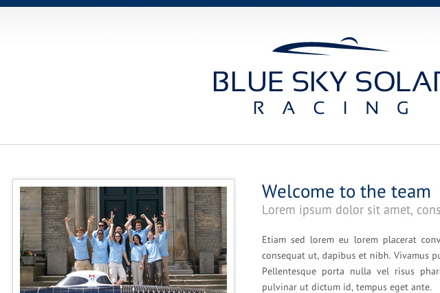
Original mockup for the website, which strove to embody competence and forward thinking.
-
3

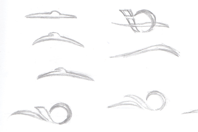
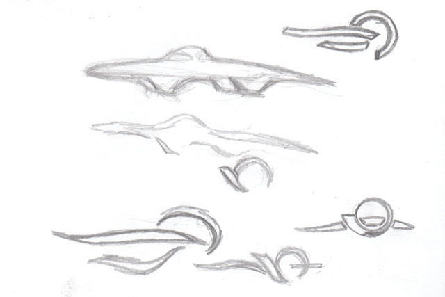
Initial logo sketches tried to capture the movement and aerodynamics of the previous logo, but in a simplified form.
-
4

Background
In 2010 I volunteered to design a new identity for my university’s solar car team. They were in the process of building a new car and wanted a brand that embodied their dedication and attention to detail – their current logo was too convoluted to achieve this.
Goals
- Develop an identity that matched the team’s perception of itself.
- Produce something the team could wear proudly when they competed in the World Solar Challenge.
- Pay homage to their existing logo, which contained a series of elongated, flowing shapes and the shape of a sun.
Constraints
- The new identity had to have the full support of the team, a close-knit group of engineers.
- Had to be true to their aspirations and motivations for undertaking the project.
- The team wanted a look that was "sleek and professional".
Process
To ensure widespread support for the new branding among team members, the logo development required numerous consultations with the group. From the early stages, it was clear that some on the team were attached to their existing logo.
It was easier to get team members onboard with a new, sleeker font for the logo's text, so I started there. The typeface I selected was Sansation, with the team name written in all caps. In addition to being clean, stately and having a somewhat futuristic look, this font had the nice property of gaps in the letters, such as the cross bar of the "A". Without additional effects applied to the text, these gaps give the impression of a light source shining down from the upper left, especially when the logo is presented light on dark (see 1). For the logo of a solar car team, this felt apropos. I contrasted the tighter spacing of "Blue Sky Solar" with that of "Racing" to lend the latter a sense of speed.
My first logo sketches were rejected for alternately being too similar or too different from the current one (3, 4). More importantly, the team members wanted the logo to include a more literal rendering of the car.
Going back to the profile of the 2011 car, I noticed how far back the canopy was placed. Using this, I traced the curves of the car’s profile to evoke not only a profile of the car in motion, but also a horizon. When viewed this way, the negative space above the logo forms the eponymous "blue sky", the profile swoosh evokes terrain, while the canopy represents the sun (1). These different interpretations of the logo complete an image of the team that is hopeful, progressive and forward-looking, in addition to fulfilling the original brief.
The team was pleased with the results. The new identity has since been used on their cars and uniforms in both the 2011 and 2013 World Solar Challenges.
-
Portfolio designed in Toronto by Ben McCanny. Entypo icons by Daniel Bruce — www.entypo.com
